

Day six of the yeah write community following ProBlogger’s 31 days to build a better blog: make your blog mobile-friendly
You need a copy of the 31dbbb workbook? Click here. There’s no 31dbbb grid today since it’s not a writing exercise. We invite you to be all robust in the comment section with your topical discussion.
Show of hands: who knows what percentage of your blog traffic is from mobile browsers or tablet PCs or iPads?
Have you installed a blog stats tracker on your blog, yet? If not, stop reading and go do that now. Yeah write recommends Google Analytics or Clicky or both. We’ll wait until you get back. Here’s a fun video for the rest of us while we stand around ’til you return.
“Two Chips” / An Animated Short from Adam Patch on Vimeo.
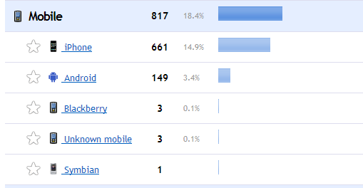
Now, let’s check our stats for a good estimate of the percentage of mobile visitors
Using two snapshots (click to embiggen images) of yeah write’s stats on Clicky, yeah write has nearly 20 percent mobile visitors coming in either on a mobile platform or a mobile browser. What’s the difference between a mobile platform or mobile browser? The platform is the device itself: iPhone, iPad, Android phone. The browser is a web browser converted for mobile devices, but it can be viewed on various platforms. For example, when you email an interesting article you’ve found while using your phone (the platform), the web browser may send your recipient the mobile version of the web page even if the recipient is using a desktop computer.

Your percentage of mobile visitors may be higher or lower than that of yeah write, but, in general, the number is rising across the web. Not many of us in the yeah write community run e-commerce sites, but we certainly purchase from them. We know first-hand how important it is to be user-friendly for all visitors, not just the ones sitting at a desktop computer. Sometimes, we need to buy that shirt while we’re waiting for the next bus. Along the same reasoning, sometimes our blog visitors need to leave that comment for us right then. On the bus, on campus, at work (ahem), on the go. It’s hard enough to capture and retain regular blog visitors; we should make it as easy as possible for them to engage wherever and however they surf in.
You don’t have to be super duper mobile friendly, but don’t be downright hostile, either
Here are screenshots (click to embiggen images) of a local business I ended up calling with the complaint “Your web site is too hard to navigate. All I needed were your business hours, I shouldn’t have had to call you for them.” I’m sure I made their day.


The best way to make your blog mobile-friendly? Responsive themes
Responsive themes, available on all major blogging platforms, adjust the width of your blog’s header, content and sidebar containers to match the width of the user’s mobile browser. You don’t have to do anything but make sure you’ve installed a responsive theme, and now that you know what they are called, you can perform a features search when looking for your next theme.
WordPress self-hosted responsive (click to embiggen images)


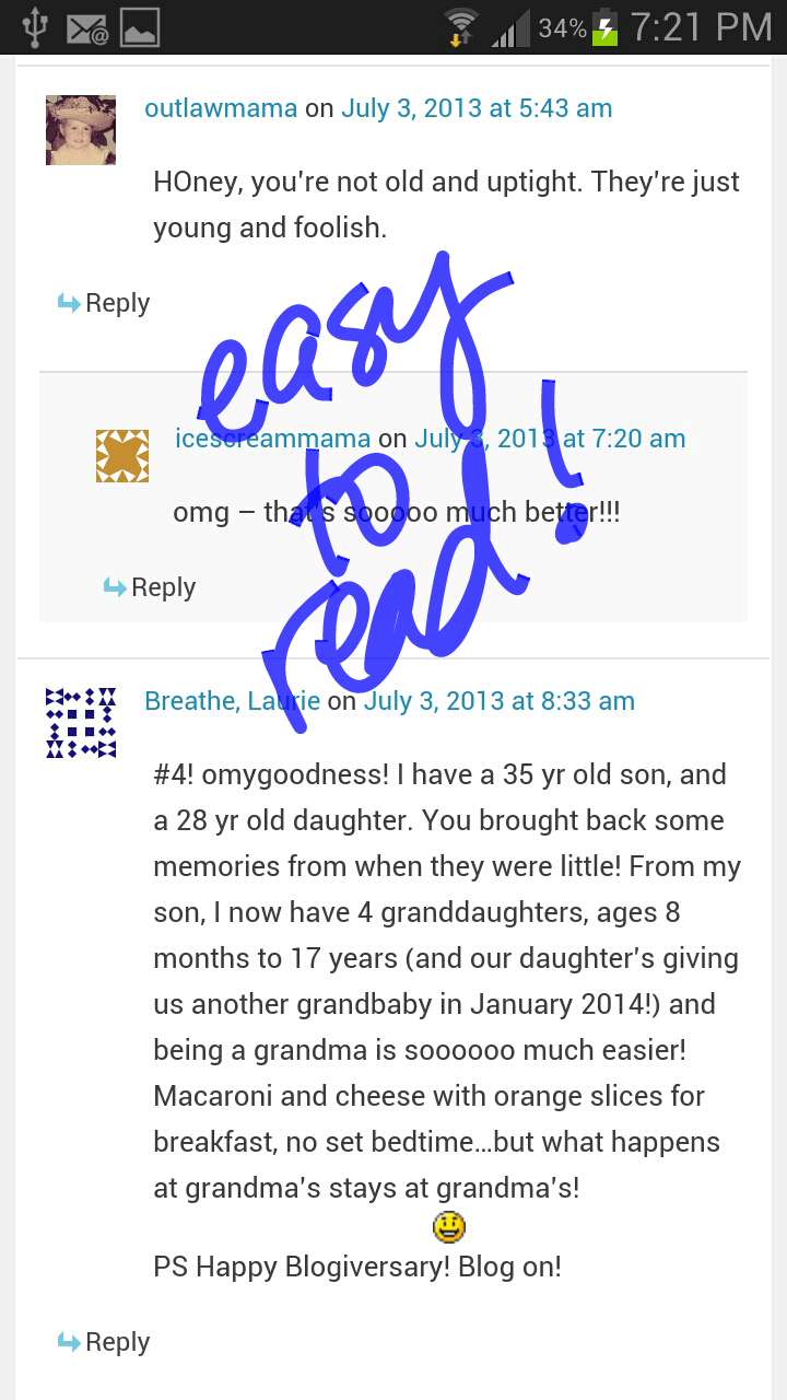
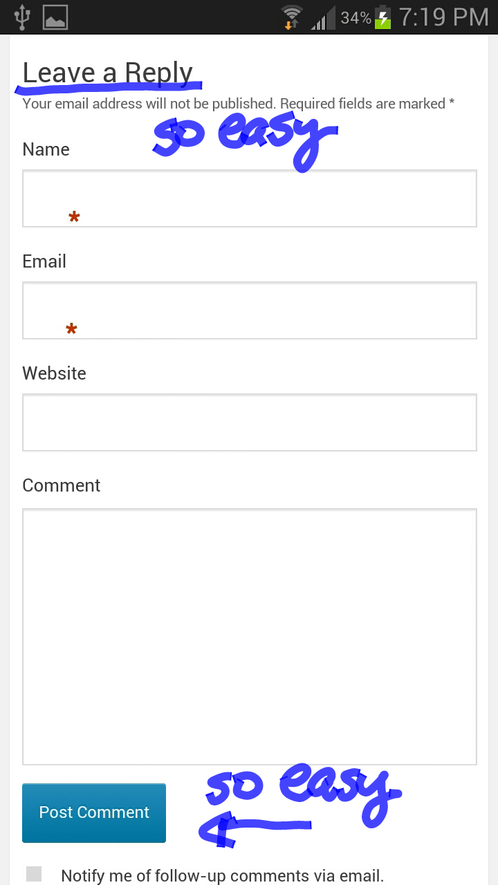
Blogger responsive (click to embiggen images). Easy to read, but nearly impossible to comment on posts from a mobile device.

WordPress-hosted with Jetpack installed (click to embiggen images)

What if you like your non-responsive theme just the way it is? Is there another way to accommodate mobile visitors?
[unordered_list style=”green-dot”]
- If you’re on self-hosted WordPress, you can try WP touch, a premium plugin designed to create a mobile-friendly layout for your blog
- If you’re on WordPress.com, activate the mobile feature in Jetpack and you’re good
- Blogger? You’re gonna lose comments either way it goes, even if you go with Intense Debate or Disqus. When your visitors reach your Blogger blog on a mobile, Blogger defaults to its native commenting system. Doesn’t matter since Intense Debate and Disqus act like they’ve never heard of a mobile browser and tend not to cooperate with host sites anyway
- Test your add-on to make sure it works. Some WP.org add-ons change pages, going to the next post, when all the user wants to do is scroll down to the next paragraph. If the add-on is frustrating your user, get rid of it
- Turn off CAPTCHA
[/unordered_list]
Anybody up for a giveaway of a new, responsive WP theme?
I mentioned this in Wednesday’s 31dbbb post: if you are looking for a new WordPress premium theme or are thinking of moving to self-hosted WordPress sometime soon, just leave us a comment in this post and, in a few days, we’ll announce the winner of a new responsive WP theme from Elegant Themes. Head on over to the Elegant Themes site, see if there’s anything you like, then enter the drawing. You don’t have to choose right now. Just say “I’m in” and that’s good enough. You’d be on your own for installation, btw. I’ve gone back to work full-time and I have two yeah write editors in my queue who’ve been waiting for a new theme for a year. I’m a terrible friend. If you need a recommendation for a (paid) installation more than you need a new best friend, let us know.
Any other mobile-friendly suggestions or success stories? Leave ’em in comments…


I have a self-hosted site and turned on the mobile feature on Jetpack. I just tested it with my phone, and it looks fabulous!
I was able to install Clicky on my WordPress.com blog, but I also have StatCounter as well as whatever Stats WordPress uses.
Once I get through these 31 days I’m definitely going to consider finalizing the title of my blog and just buying a domain and self hosting. I hate the limitations Blogger and WordPress put on us!
I need first of all to say that Reedster is right: Erica is magic like Santa. Plus a HUGE shoutout: last summer my sad blog got a massively fabulous renovation courtesy of Erica & Q. They should run a show, like “can this blog be saved,” so that everyone can see their magic. Worth every dime I spent, and when is the last time you were able to say that about anything other than…well, I don’t know what. My blog even looks good on my phone (although…er…I am now having to biggify the print so I can read it).
Deb, I’ll be over to make your blog even more mobile-friendly. Plus, do you remember when you asked me for a plugin last October? It fell off my radar, but I am NOW ON IT.
Thanks for the compliments on Q’s and my design work. You were a pleasure to work with.
Catching up on the last two days of 31 dbb – added Clicky to my wordpress.com hosted site and checked my site via mobile. I don’t have any idea what I’m doing with Clicky – I think it’s still counting my visits even though I enabled the cookie. I’ll check it again tomorrow. Off to today’s lesson!
Missed the first week on 31dbbb because of vacation, but catching up now…I use an Elegant theme (Lucid) that is fully responsive, and I check my blog on the iphone and ipad to make sure it’s readable. I lose my sidebar widgets on the iphone, but my content is easy to read. Just checked Google Analytics and about 1/3 of my page hits are from mobile devices. I’m going to eventually move to a different theme, but I will make sure it is a responsive one!
I think I’m in the ‘can’t use google analytics because wordpress.com’ boat. (>_<)
I'd consider trying a new theme, since I'm not super attached to the one I have, but are the potential giveaway "Elegant Theme" themes compatible with wordpress.com? It seems like there are only a set amount of themes I can choose from with them…
Clicky can be installed on WordPress.com. There are instructions to be followed on its site. For the giveaway, you will have to move to self-hosted. We will have prizes next week for those not on self-hosted blogs.
When I was redoing my site I had this conversation with my designer. Can’t really remember right now why I never ended up with a mobile design. Thanks for bringing this back to mind.
Blogger on my phone is awful, which is why I haven’t been commenting as much on the challenge grid posts lately. I spend so much time on my phone, and while that is not what I want to be doing, it’s what I need to be doing. But I don’t complain because I know people have the same problem on mine.
I am going to learn WordPress if it kills me. And I’m going to try not to let it kill me.
I finally figured it out a couple of weeks ago, so today I asked my friends in a FB group to check it. Everybody says it looks fine. 🙂
I am currently trapped on The Island That Technology Forgot so am having trouble checking email let alone doing tech-y bloggy stuff BUT I am totally going to move my archaic blogger blog over to self hosted Word Press when we get back to civilization later in the week. I’d love a new mobile responsive elegant theme so enter me in the drawing please!
I am on blogger (for now) so you can read my blog, but not comment, due to the annoying blogger platform thingy. I had installed intense debate but a-hole spammers from mobile devices made it go right back to the old one. Sigh. Did someone say google analytics doesn’t work on self-hosted wordpress? Should we go to that jetpack thing you keep talking about? Or something else?
I just noodled around in Cindy’s dashboard. I turned on the mobile feature and checked she had her Jetpack stats turned on. So, yeah, try all the Jetpack features that sound good to you, then report back. Thanks!
This terrifies me.
It took me 20 minutes to leave a comment on your post today from my phone. I’ll be over later this afternoon to fix that.
Okay! Your blog is now officially mobile-friendly. 31dbbb activities for the win.
Wow! That *was* really easy! First you fixed my subscriber email issue just BY THE POWER OF YOUR MIND, and now this. ERICA IS MAGIC LIKE SANTA.
I do a lot of blogging from my mobile but somehow I never wondered about what OTHeR PEOPLE see when they’re on my site on a mobile. I will check my clicky on a desktop and see what’s need to be improved.
Your blog is very hard to navigate with the mobile plugin or add-on you’re using. Whenever I touch the screen, it takes me to an entirely different post. Then I have to wait until I can get to my laptop to read it. I was unable to read your challenge entry until you’d already won the popular vote.
Just test different methods, and let me know if you need any help.
Oh I thought it was my mobile because that happens on all the blogger blogs that I go on. Do I need to change the theme?
I’d play around with different ones until you find one that behaves better. Keep me posted! Don’t forget to search for the responsive feature.
After quite a bit of time Googling, I found out that I can’t install Google Analytics on my wordpress.com site. Does anyone know if the same is true for Clicky?
Jetpack comes with a good stats tracker, so activate that component if you haven’t already. WordPress.com doesn’t play nicely with scripts for outside apps. I’ll do some extra investigating then update the post. Thanks for the reminder.
I discovered that you don’t need JetPack with a wordpress.com site (where no plug-ins are allowed). Also, you can check to see if you are mobile-friendly via your dashboard. The default is a mobile theme. Go under “Appearance” to make sure you don’t have this disabled.
I hope they’ve fixed the scrolling bug. Much like Blogger, the mobile app would scroll to the next page on the blog instead of allowing the user to scroll down the page. Can Jetpack not be installed at all?
This is what I read on JetPack’s support page:
“Don’t see a Plugins menu in your dashboard? Then your site is probably on WordPress.com and you don’t need Jetpack–its features are already bundled into your site!”
There is no plug-in option on wordpress.com. I think that’s why I can’t do Google Analytics or Comment Luv.
OKay, then much like the writers using Blogger, you are stuck with what you have unless you can upgrade to a new theme. Keep me posted!
We can use Clicky on a wordpress.com site. The information provided in limited, but useful enough.
I do almost all of my computing on a cellphone and a Nook color and frequently have to turn away from a blog I would have liked to read because is either too hard to read or simply won’t load on my mobile devices. Also features like captcha make commenting difficult from a mobile because they are so hard to read on tiny screens.
Really useful info Erica! I’d never checked. I just did and I’m good 😉 Not sure I have the best theme but it’ll hold me over until the redo.